
The Brief
True Spirit is a new internet retailer for schools and parents who want a modern school uniform for K-12 children. It offers updated uniform styles, provides a checklist of "must-haves" from the school's administrator for each school year, and recommends accessories allowed by the school's dress code. Unlike most traditional suppliers, True Spirit encourages visitors to express their tastes -with some limits.
This was an individual project for a fictional company that I had two weeks
to complete.
The Solution
I created an online shopping platform that enables parents to sign up for an account, create profiles for their children with their school details, and shop for each child using a school administrator created checklist. When parents input sizing information for their child, checklist items automatically display in the suggested size for the child, and only display in the approved school colors.
The Team
Stephanie Hudson - UX Design
- User Interviews
- Competitive Analysis
- User Flows
- Wireframes
- Usability Testing
- Prototype

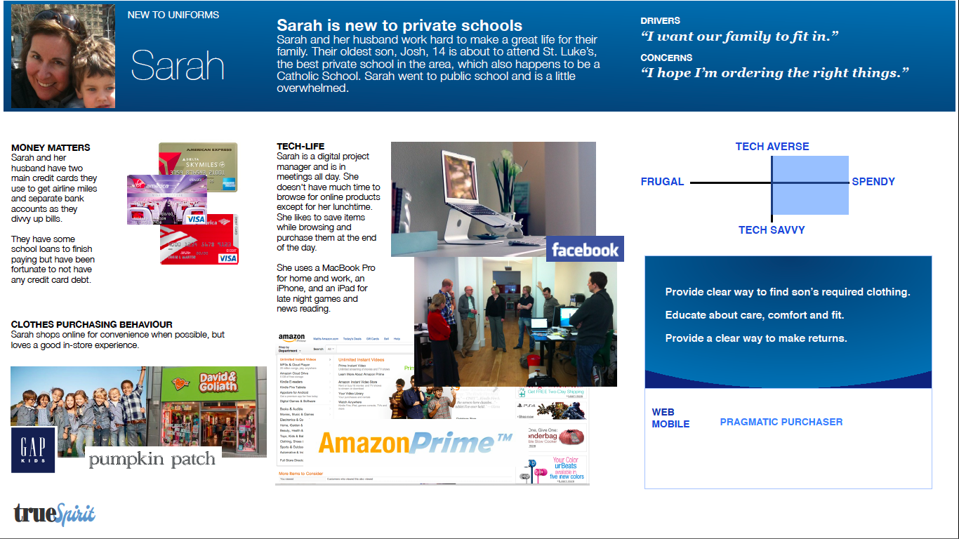

For this class project, I was supplied with a company brief and three personas (two parents, one school administrator). I focused my attention on the parent personas because they would be the core users of the site. While both parents had specific needs, I designed a flow that focused on Sarah, the parent who was new to uniforms and was nervous about her child fitting in. Focusing on and designing for the user with the least experience with uniform shopping allowed me to create a platform that a wide variety of customers could easily navigate.
While researching online uniform retailers, I noticed that the interface was very clunky when compared to online clothing retailers like Gap.com. When I interviewed parents who bought school uniforms for their children, one of the biggest complaints was that current uniform online retailers did not filter out non-approved school colors, making it necessary for them to keep track of all the colors for their child's school. For parents who have children in different grades, or even at different schools, this could be a frustrating experience.


After my researching phase, I began sketching explorations on user flows. There were many ways users could navigate through True Spirit to buy the clothing their children needed. I explored allowing users to shop by gender, as well as imagining a digital outfit generator. Fashion blogs also came to mind, and I explored the idea of photos with outfit tags that could lead parents to the products. Due to time restraints, I had to simplify my scope and focus on a parent/child profile and checklist flow.
Once I defined my scope, I began to sketch user interfaces. I began by integrating the child profile with the checklist so users could always see which child they were shopping for. I also explored separating the child profile from the checklist. The results from user testing overwhelmingly favored the latter option. Users I tested felt that the interface was cleaner and easier to understand when the profile and checklist were separated.


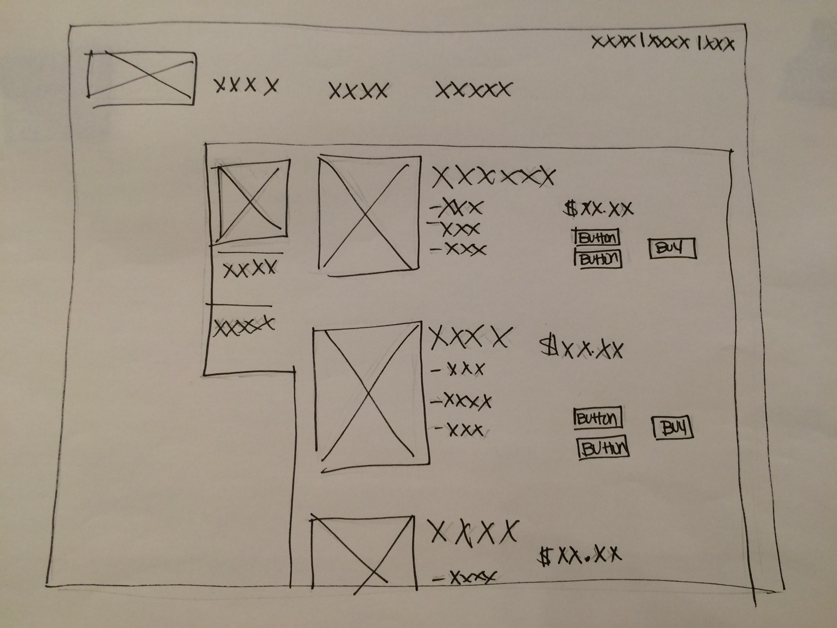
Using the information gleaned from testing, I took my sketches digital using Omnigraffle. The original concept had a checklist with boxes users could tick off when they had purchased an item of clothing. It would also feature items recommended by True Spirit and approved by their child's school.
When I tested this with users, they said that having the checklist and the featured items on the same page seemed redundant. Users also expressed the need for the checklist to be organized by category so they could quickly find a certain item, like a polo shirt or a pair of shorts.
In the milestone wireframe I integrated user feedback by making the checklist more visual by adding pictures of the clothing items. The checklist was also organized by category, and those categories were collapsable so users could view as many or as few items as they wanted. The featured items list was removed and replaced by a friendly prompt to choose an item on the checklist to begin shopping for their child.

Click on image to view prototype in InVision
This milestone wireframe takes the user from login, to profile page, to checklist, and to the product page. Users can view their child's profile and change sizes and schools as needed. The checklist is always visible while shopping so users can keep track of what they have purchased.The shopping cart is visible underneath the checklist so parents can also monitor their budget.
The wireframes I created speak to the user and the business needs identified in my research. Making the shopping experience easy for the user translates into more purchases and repeat business for True Spirit. Given more time, I would run more user tests and explore flows for shopping for multiple children simultaneously.